微信小程序可以通过监听元素的高度进行文本自适应的展开收起,建议封装成组件,以便使用
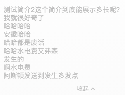
效果
先看效果

组件的wxml文件
<!--components/adjustableText/adjustableText.wxml-->
<text class="content {{ isShowMore ? 'content-open' : 'overlines-hidden' }}" style="font-size: {{ fontSize }}rpx;color: {{ fontColor }};{{ isShowMore ? '' : '-webkit-line-clamp:' + n + ';' }}" selectable="{{ selectable }}">{{ content }}</text>
<block wx:if="{{ showShowMoreBtn }}">
  <view wx:if="{{ !isShowMore }}" style="margin-top: 20rpx;" class="col center">
    <view class="row center"  bindtap="showMore">
      <view style="font-size: {{ btnFontSize }}rpx;color: {{ btnFontColor }};">展开</view>
      <image src="/assets/icons/arrow/arrow_bottom.png" style="width: 32rpx;height: 32rpx;"></image>
    </view>
  </view>

  <view wx:if="{{ isShowMore }}" style="margin-top: 20rpx;" class="col center">
    <view class="row center"  bindtap="showMore">
      <view style="font-size: {{ btnFontSize }}rpx;color: {{ btnFontColor }};">收起</view>
      <image src="/assets/icons/arrow/arrow_bottom.png" style="width: 32rpx;height: 32rpx;transform: rotate(180deg);"></image>
    </view>
  </view>
</block>
组件的js文件
// components/adjustableText/adjustableText.js
Component({
  /**
   * 组件的属性列表
   */
  properties: {
    content: String,
    n: {
      type: Number,
      value: 2
    },
    fontSize: {
      type: Number,
      value: 28
    },
    fontColor: {
      type: String,
      value: '#333333'
    },
    btnFontSize: {
      type: Number,
      value: 24
    },
    btnFontColor: {
      type: String,
      value: '#333333'
    },
    selectable: {
      type: Boolean,
      value: false
    }
  },

  /**
   * 组件的初始数据
   */
  data: {
    isShowMore: true, // 默认展开 以便于判断区域高度
    showShowMoreBtn: false,
  },

  lifetimes: {
    attached: function() {
      // 在组件实例进入页面节点树时执行
      this.createSelectorQuery().selectAll(".content").boundingClientRect(res => {
        if (res[0].height > this.properties.n * this.properties.fontSize / 2) {
          this.setData({
            isShowMore: false,
            showShowMoreBtn: true
          })
        }
      }).exec()
    },
  },

  /**
   * 组件的方法列表
   */
  methods: {
    showMore: function (e) {
      this.setData({
        isShowMore: !this.data.isShowMore
      })
    },
  },

})
组件的wcss文件
.row {
  display: flex;
  flex-direction: row;
  box-sizing: border-box;
}

.col {
  display: flex;
  flex-direction: column;
  box-sizing: border-box;
}

.sb {
  justify-content: space-between;
}

.center {
  align-items: center;
}

/*  */

.content {
  margin-top: 24rpx;
  width: 656rpx;
  line-height: 34rpx;
  color: #BFBFBF;
}

.content-open {
  display: block;
}

.overlines-hidden {
  overflow: hidden;
  text-overflow: ellipsis;
  display: -webkit-box;
  /* -webkit-line-clamp: 2; */
  overflow:hidden;
  /*! autoprefixer: off */
  -webkit-box-orient: vertical;
}
使用方法
在需要使用的page的.json文件将文件引入
"usingComponents": {
    "adjustable-text": "/components/adjustableText/adjustableText"
  },
在要使用的page中
<adjustable-text content="这是一段测试文本" n="{{ 2 }}" font-size="{{ 28 }}" font-color="#BFBFBF" btn-font-size="{{ 24 }}" btn-font-color="#BFBFBF" selectable="{{ false }}"></adjustable-text>参数说明:
content: 文本内容n: 超过n行后收缩,默认2行font-size: 文本的尺寸,单位rpx,默认28rpxfont-color: 文本的颜色,默认#333333btn-font-size: 收起展开按钮的文字大小,单位rpx,默认24rpxbtn-font-color: 收起展开按钮的文字颜色,默认#333333selectable: 是否可以选择文本,用于允许选择复制文本的情形,默认为false
资源文件
组件用到的箭头图片也给大家一起放这了

欢迎小伙伴们在下方评论区留言 ~ O(∩_∩)O
文章对我有帮助, 点此请博主吃包辣条 ~ O(∩_∩)O
猜你喜欢
- Unchecked runtime.lastError: The message port closed before a response was received.
- bower下载路径修改
- img标签nofollow: Does it make sense to have a rel="nofollow" attribute in img tag?
- HTML a标签的内容超出a标签 解决
- simplemde全屏被挡住,已解决
- npm安装的包如何引入css, js
- An invalid form control with name='xxx' is not focusable
- CSS实现鼠标移动到图片或按钮上改变大小
- 如何实现滚动列表左右半透明
- 微信小程序如何优雅的申请权限
- 微信小程序自定义组件中vdieo组件的play等方法失效
- 微信小程序双击事件
- Python服务端如何生成小程序码
- 微信小程序自动更新
- 服务器部署yapi,搭建api文档服务
- 微信小程序登录如何实现
- 微信小程序返回上一页传参
- 微信小程序自定义组件不支持全局样式
- 微信小程序js日期转换ios真机问题
- 微信小程序自定义组件中createSelectorQuery获取不到节点解决方法
- css宽度根据内容自适应
- 微信小程序订阅通知数据类型
- css图片水平居中
- js如何查找对象数组中某个对象的下标,已知对象的某个属性值
- 微信小程序云开发云存储如何批量下载文件
评论
There are no comments yet.


热门文章
- 374813 小白搭梯子教程...
- 246566 如何自己搭建SSR/SS服务端教程...
- 87978 Vultr注册并购买服务器搭VPN:ss...
- 81670 如何搭建v2ray,放弃使用ss和ssr...
- 70500 解决: Python-aiohttp.C...
- 69365 如何用Outline搭建VPN...
- 56786 Ptyhon如何免费调用Google翻译...
- 54662 Ubuntu: Termintor+zs...
- 52892 MySQL配置文件加载顺序...
- 52448 免费ss、ssr账号分享,Shadows...
大家都在看
标签
AdSense
Anaconda
Android
apache
API
apt
Auth
AWS
B-tree
Bandwagon
Blog
bower
brew
bytes
Caffe
Catalina
certbot
Charles
cloudcone
Composer
conda
CoreML
CPU
crontab
CSS
csv
Cuda
cv2
datetime
Digitalocean
DNS
Docker
Docker-Compose
Eloquent
Excel
export
Flask
FTP
GET
Git
GitHub
GitLab
Gmail
GoDaddy
Google
GTM
hash
Homebrew
Homestead
HTML
http
HTTPS
IDEA
image
imagemagick
imagick
imgick
import
InnoDB
ios
iou
iPhone
ISO8601
iTerm2
Java
JavaScript
JPG
JS
Keras
Laravel
Laravel-Admin
lazyload
Linux
list
Livewire
lnmp
load
logs
Lravel
Mac
Markdown
matplotlib
md5
mix
MobileNet
Mojave
mongo
MongoDB
MySQL
Namesilo
Nginx
Node
npm
numpy
Nvidia
Nvidia-Docker
onevps
OpenCV
Openpose
openpyxl
oss
Outline
parse
PayPal
PHP
php-fpm
PhpStorm
PHP扩展
PIL
Pillow
pip
PNG
POST
Protobuf
PyCharm
pyenv
pymongo
Python
Python,人工智能,机器学习,VOC,xml
Queue
Redis
requests
RGB
Sanctum
save
selenium
SEO
Shadowsock
Shadowsocks
ShadowsocksR
simplemde
Spring Boot
SQLServer
ssd
SSH
ssl
SSL证书
SSR
str
Sublime
sudo
swap
Swift
Tensorflow
TensorflowLite
Terminal
Terminator
timestamp
Ubuntu
urllib
UTC
v2ray
Valet
Validation
Validator
VienBlog
virtualenvs
VPN
VPS
Vultr
Web
Windows
WordPress
Xcode
xlsx
yaml
YAPI
YUV
zip
zmq
zsh
上网
下载图片
主从同步
云主机
云存储
云开发
云服务器
人工智能
代码管理
优化
优惠码
伪原创
作弊与反作弊
免费ss账号
免费提现
切片
前端
加密
协议
博客
友链
双击事件
后台运行
后端
命令
国内镜像源
图标
图片操作
图片转换
域名
多身份认证
大小写转换
姿态检测
安卓模拟器
安装
定时任务
定时执行
密码
密钥
导出导入
小程序码
延迟加载
异常
微信
微信小程序
快捷方式
慢查询
懒加载
提现
搜索引擎
搬瓦工
搭梯子
教程
数据库
数据重复
文件上传
无法登录
日志
日期
时区
时间
时间戳
服务器
机器学习
权限
梯子
模拟浏览器
港版支付宝
漏洞
爬虫
生活服务
用户管理
病毒
登录
目标检测
科学上网
系统升级
索引
组件
组件开发
编辑器
自动付款
自定义组件
英文伪原创
计划任务
计算机视觉
订阅通知
认证
语法
读写分离
远程仓库
远程连接
配置文件
重定向
错误异常
错误提示
队列
阿里云
香港
香港手机号
亲情非友情链接